Logo Redesign
Branding
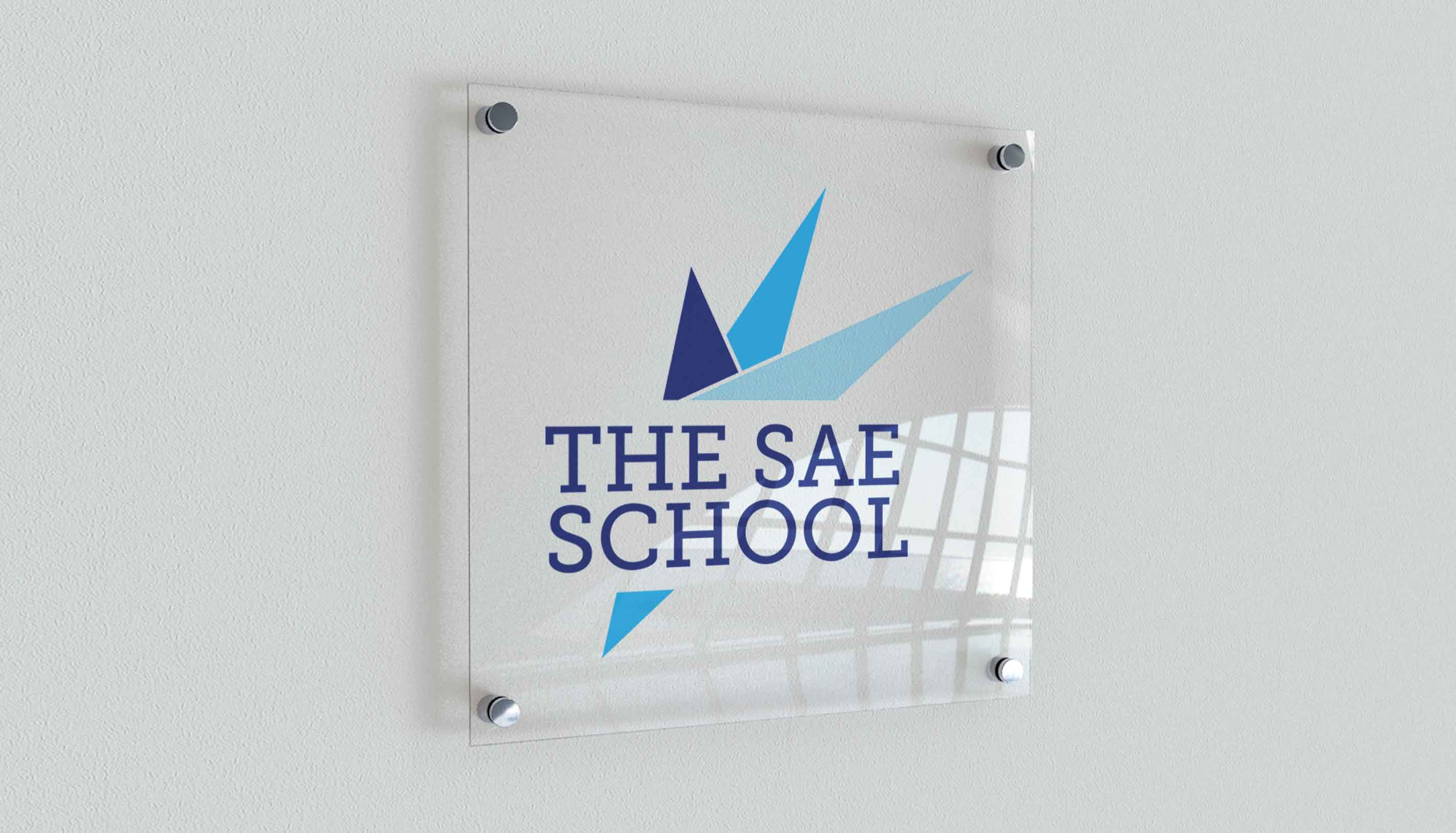
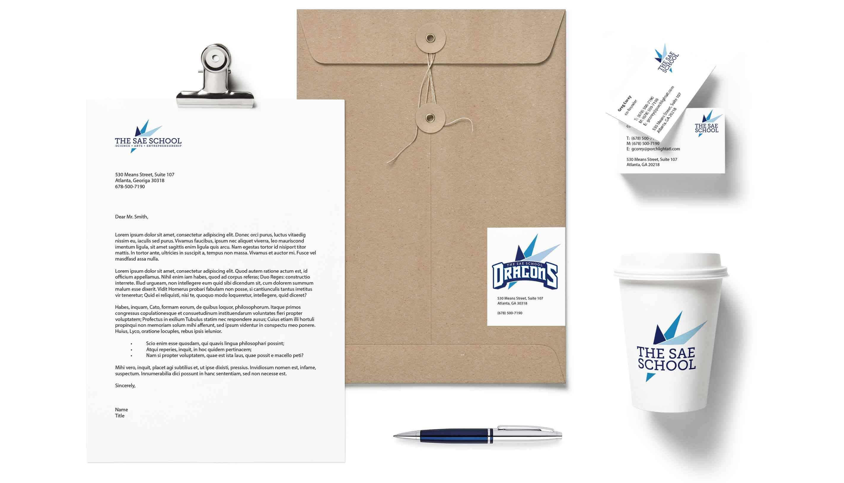
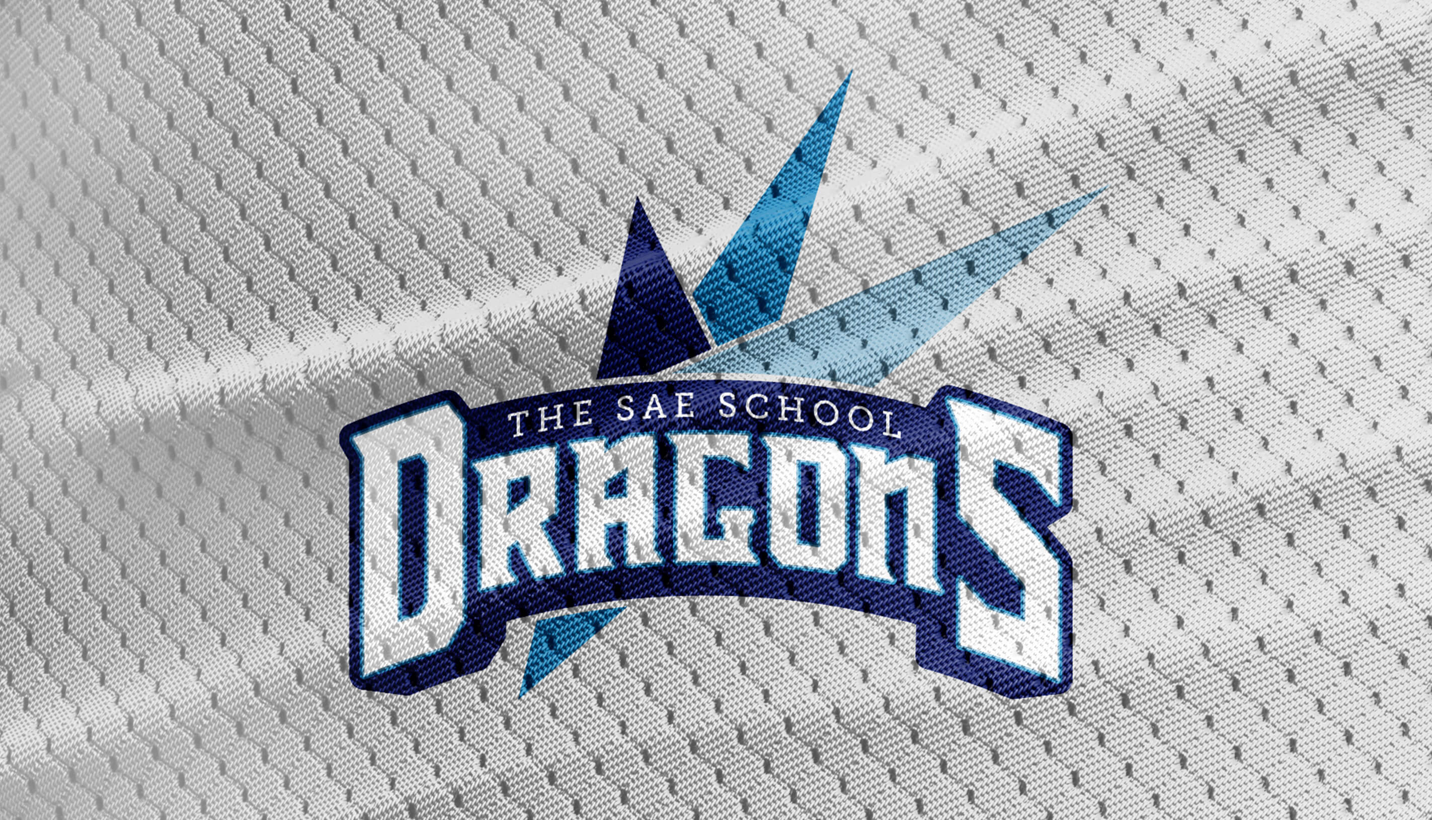
SAE is a private preschool through 12th-grade year-round school located in Mableton, Georgia. Their vision is to discover, protect, and nurture each child’s journey and use creativity to be exceptionally safe, innovative, and rigorous.
The client requested that the logo keep their blue primary color. The original logo’s three circles were turned into three spikes to represent Science, Arts, and Entrepreneurship as well as allude to a form of a dragon, the school’s mascot. This logo was designed with my friends at Porchlight.